
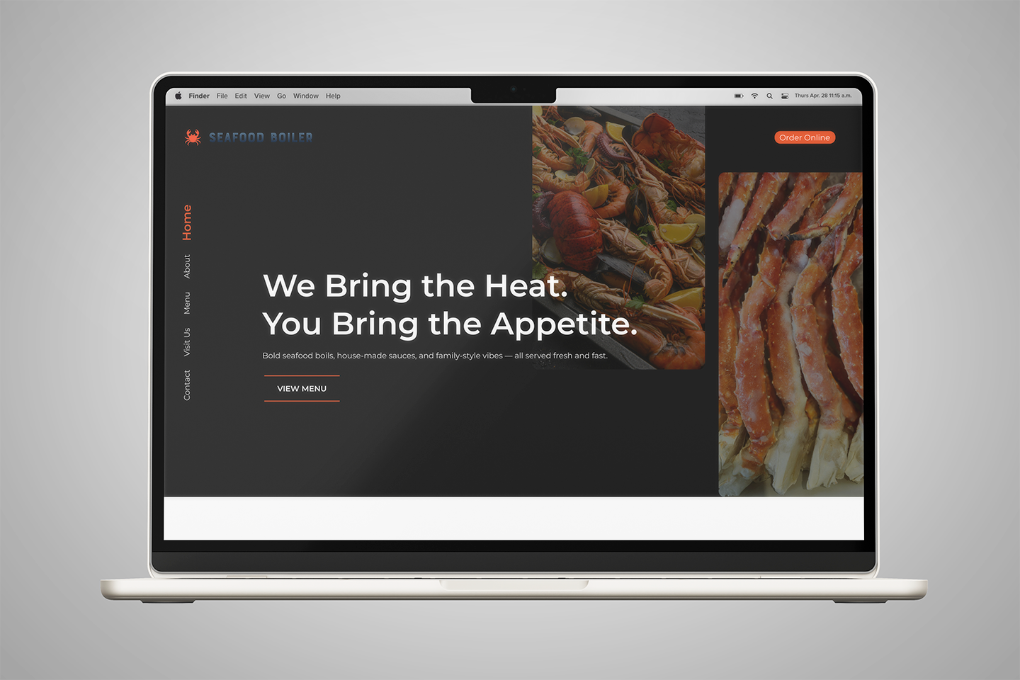
Seafood Boiler Website Design
Seafood Boiler is a restaurant website design concept created to explore how a seafood dining brand could feel bold, modern, and easy to use across both light and dark modes.
The design focuses on helping visitors quickly understand the restaurant experience, browse menu items, view featured dishes, and take action through clear buttons for ordering, reservations, or visiting the restaurant. The light mode creates a clean and fresh feel, while the dark mode gives the brand a richer and more dramatic dining experience.
Client: Concept Project
Industry: Restaurant, Seafood, Casual Dining
Role: UX/UI Designer
Project Type: Restaurant Website Design
Platform: Responsive website prototype
Focus: Website design, restaurant branding, light mode, dark mode, menu browsing, visual design, responsive layout
Tools Used: Figma
The Problem
Seafood restaurant websites can often feel cluttered when they try to show too many menu items, photos, and promotions at once. The challenge was to create a design that felt exciting and flavorful without making the page hard to scan.
The project also explored how the same restaurant brand could work in both light and dark mode while staying consistent, readable, and visually strong.
My Role
I worked as the UX/UI Designer for this concept. My role focused on designing the website layout, creating the visual direction, building the light and dark mode styles, and organizing the content so users could move through the site easily.
I focused on making the design feel bold and appetizing while keeping the user experience simple and clear.
Key Features
-
Light and dark mode design
The website includes two visual modes while keeping the same brand structure and user flow.
-
Bold hero section
The homepage introduces the seafood brand with strong imagery and clear calls to action.
-
Menu-focused layout
The design makes it easy for users to browse featured dishes and understand what the restaurant offers.
-
Clear calls to action
Buttons guide users toward ordering, viewing the menu, or visiting the restaurant.
-
Responsive website concept
The layout is designed to work across desktop and mobile screens.
UX Process
The process included:
Researching seafood, casual dining, and restaurant website design patterns
Planning the main website structure for hero, menu highlights, about, location, and calls to action
Creating a bold visual direction around seafood, flavor, and modern dining
Designing the light mode version for a clean and fresh experience
Designing the dark mode version for a richer and more elevated experience
Building high-fidelity screens in Figma
Creating a clickable prototype to show the user flow
Reviewing contrast, readability, spacing, and visual consistency between both modes