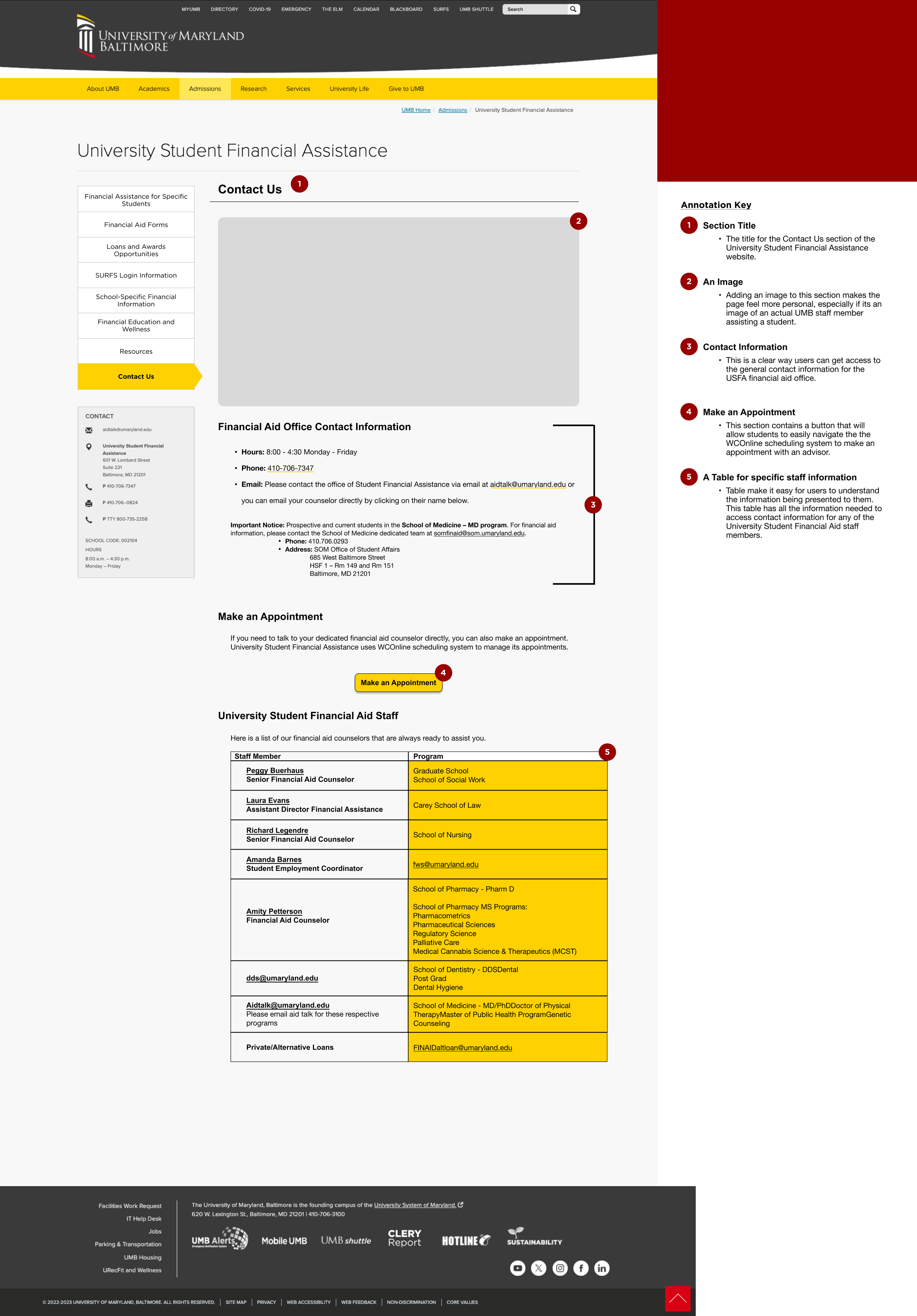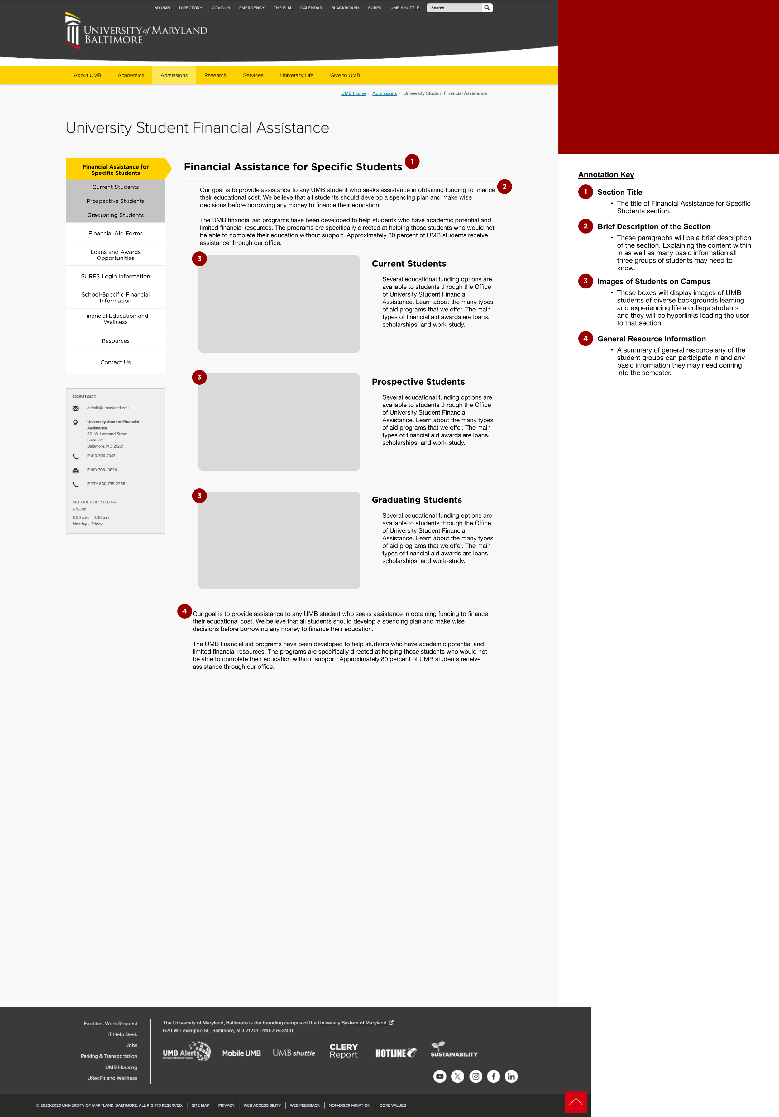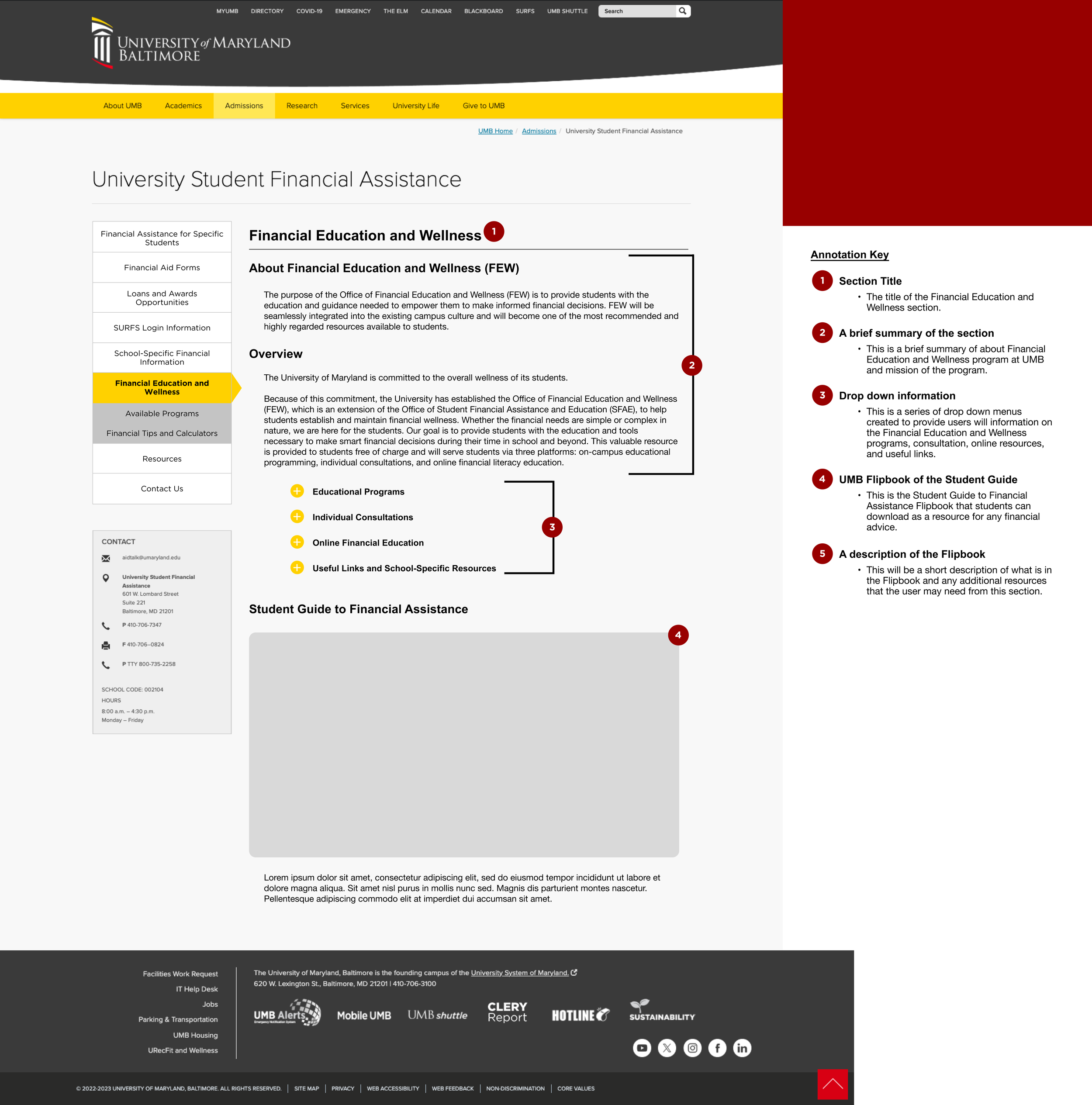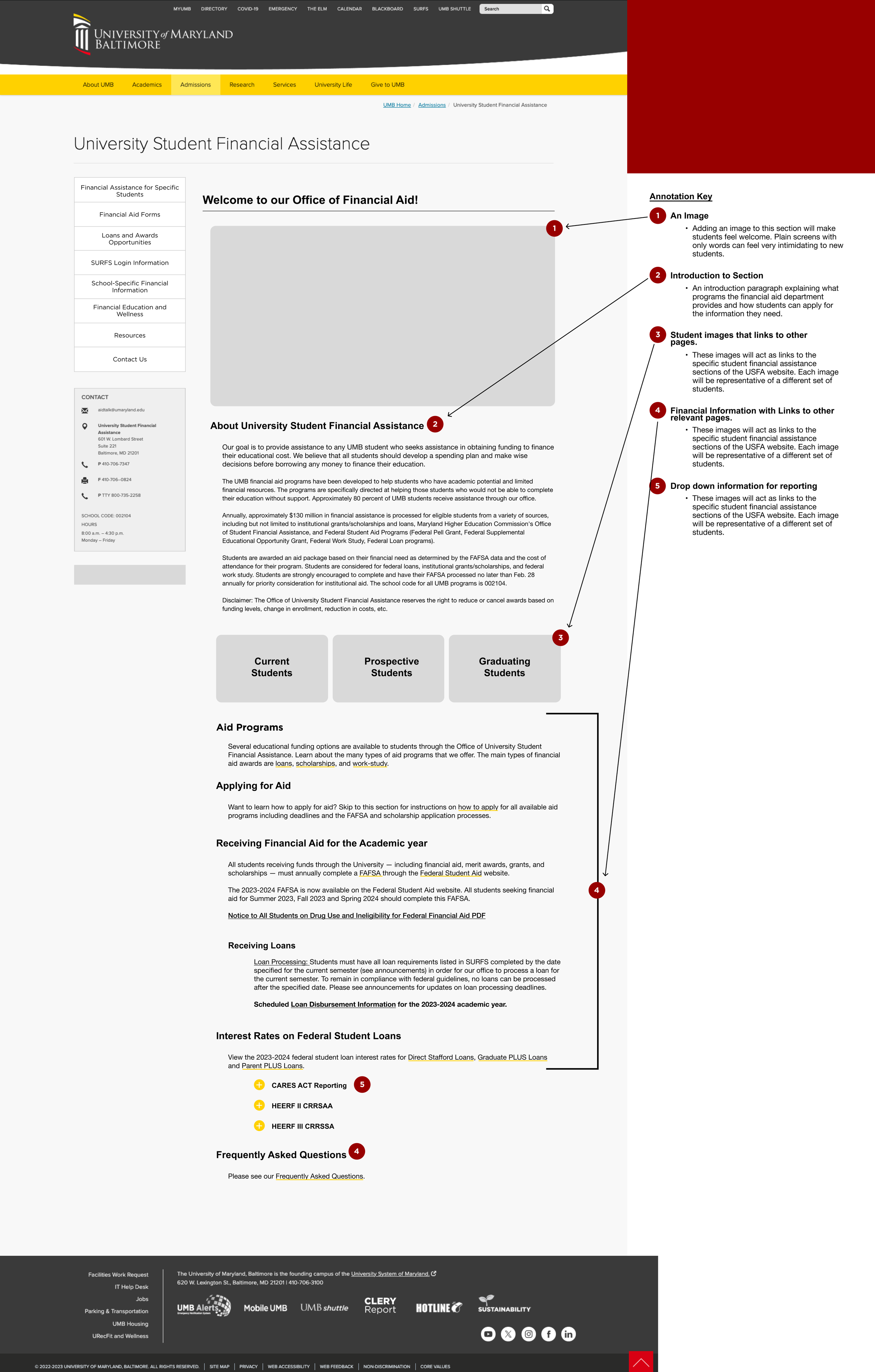
UMB Financial Assistance Website Redesign
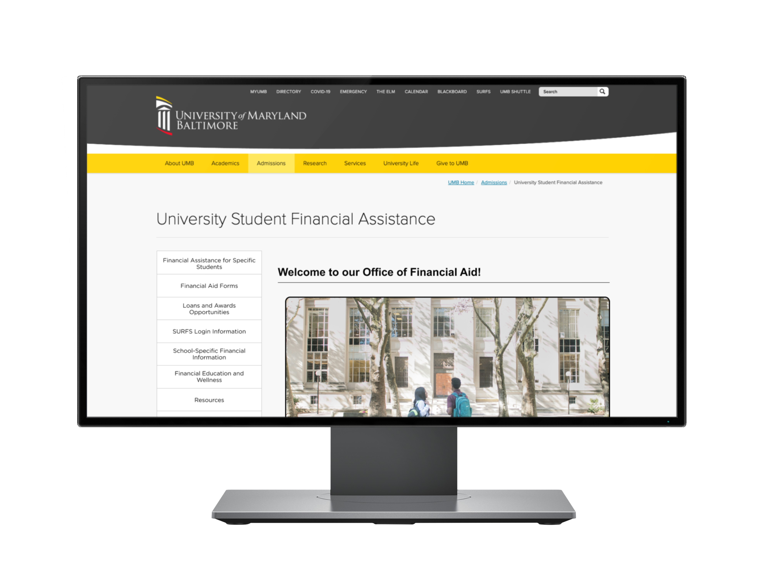
The UMB Financial Assistance Website Redesign was a graduate UX/UI project focused on improving how students, families, and university employees find financial aid information. The original site had a large amount of important content, but the navigation felt overwhelming and difficult to scan.
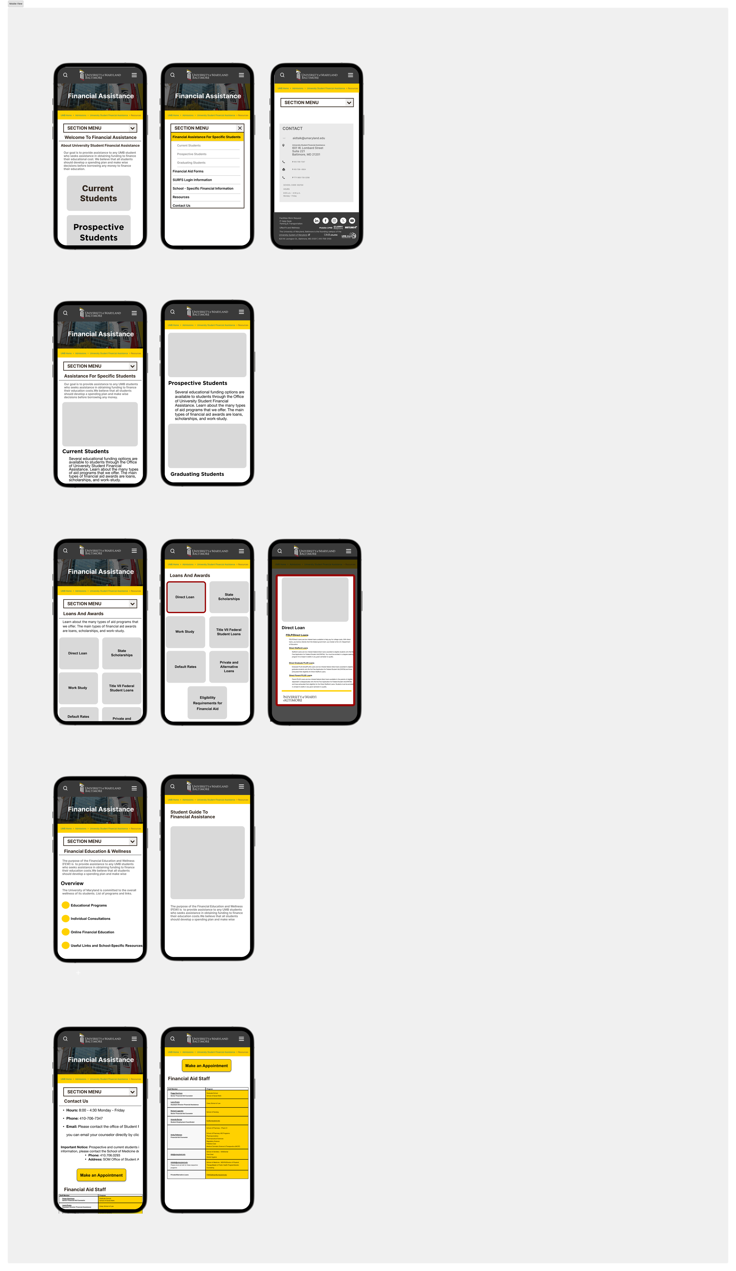
This project focused on simplifying the website structure, improving content organization, and creating a clearer path to key financial aid resources. Through content inventory, competitive analysis, personas, journey mapping, card sorting, sitemap planning, and wireframing, the final redesign reduced the main navigation from 15 sections to 8 clearer categories.
Client: University of Maryland, Baltimore
Project Type: Graduate School Project
Year: 2023
Role: UX/UI Designer
Platform: Responsive website wireframe
Focus: UX research, information architecture, accessibility, financial aid content, wireframing
Tools Used: Figma, Procreate, Canva, Optimal Workshop
The Problem
The original Financial Assistance website had too many navigation options, which made it harder for users to know where to start. Important information about loans, aid options, budgeting, school-specific resources, and student support was spread across several sections.
The challenge was to make the site easier to understand without removing important information. The redesign needed to support different user groups, including students, parents, guardians, and university employees.
My Role
I worked as a UX/UI Designer on this project, with a focus on research, information architecture, and desktop wireframe design. I helped review the existing site structure, organize content, create user personas, map the user journey, and support card sorting studies.
I also led the desktop wireframe design and helped translate the research findings into a cleaner navigation structure and page layout.
Design Process
The process included:
Reviewing the original UMB Financial Assistance website
Creating a content inventory to understand the existing pages
Researching financial aid and university website patterns
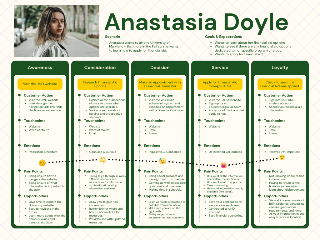
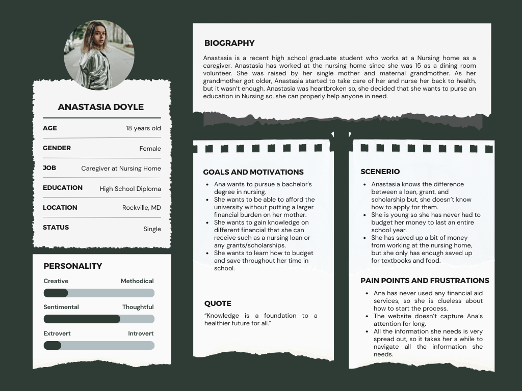
Developing personas and a user journey map
Planning a clearer sitemap and navigation structure
Running open, hybrid, and closed card sorting studies
Sketching early layout ideas
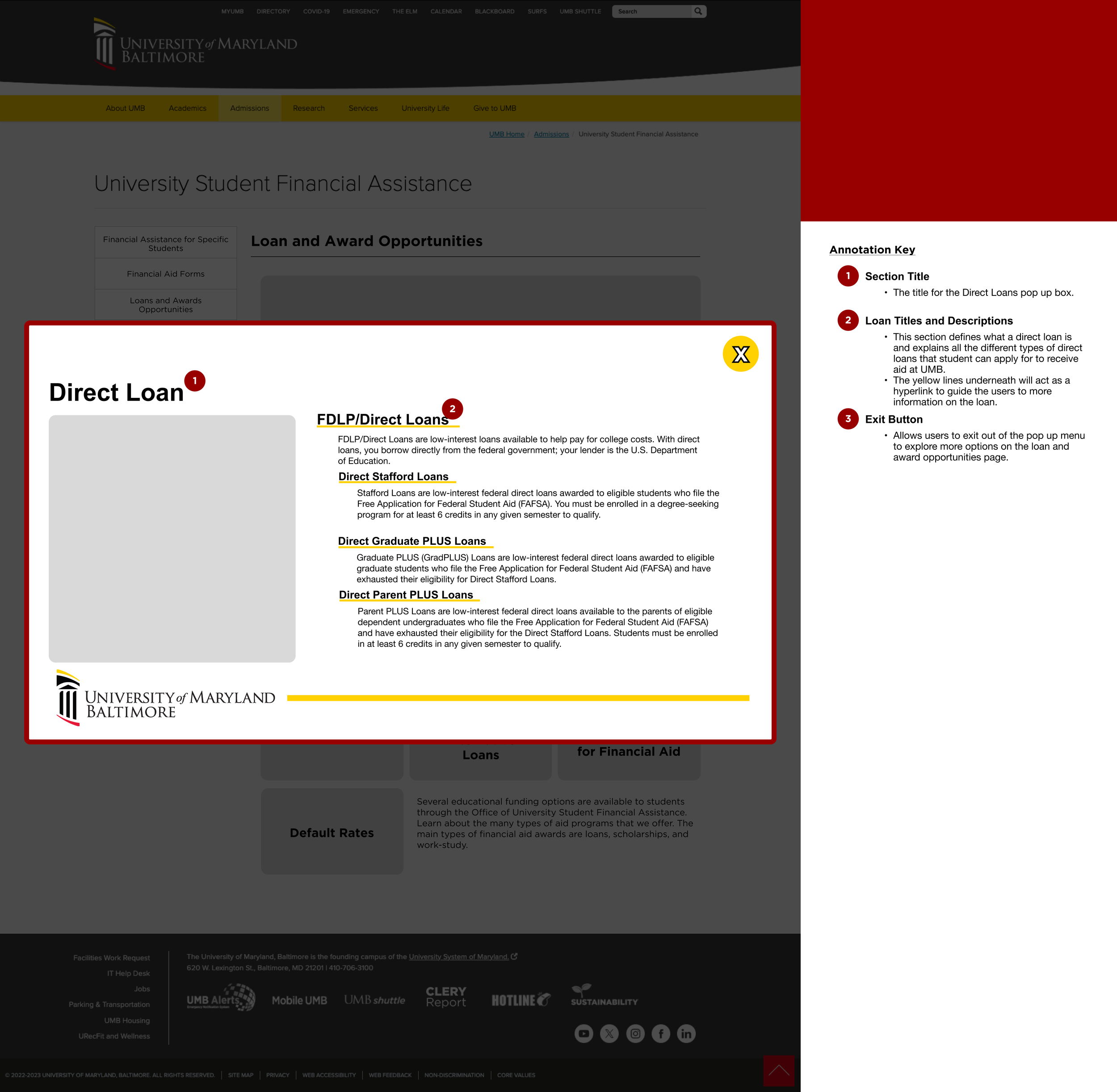
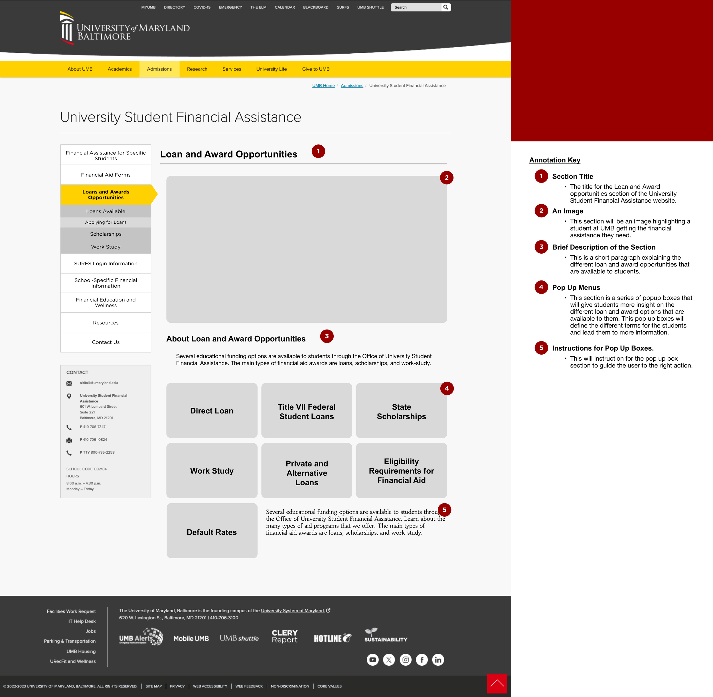
Designing desktop wireframes in Figma
Refining the navigation from 15 sections to 8 main categories
Reviewing the design for usability and accessibility