
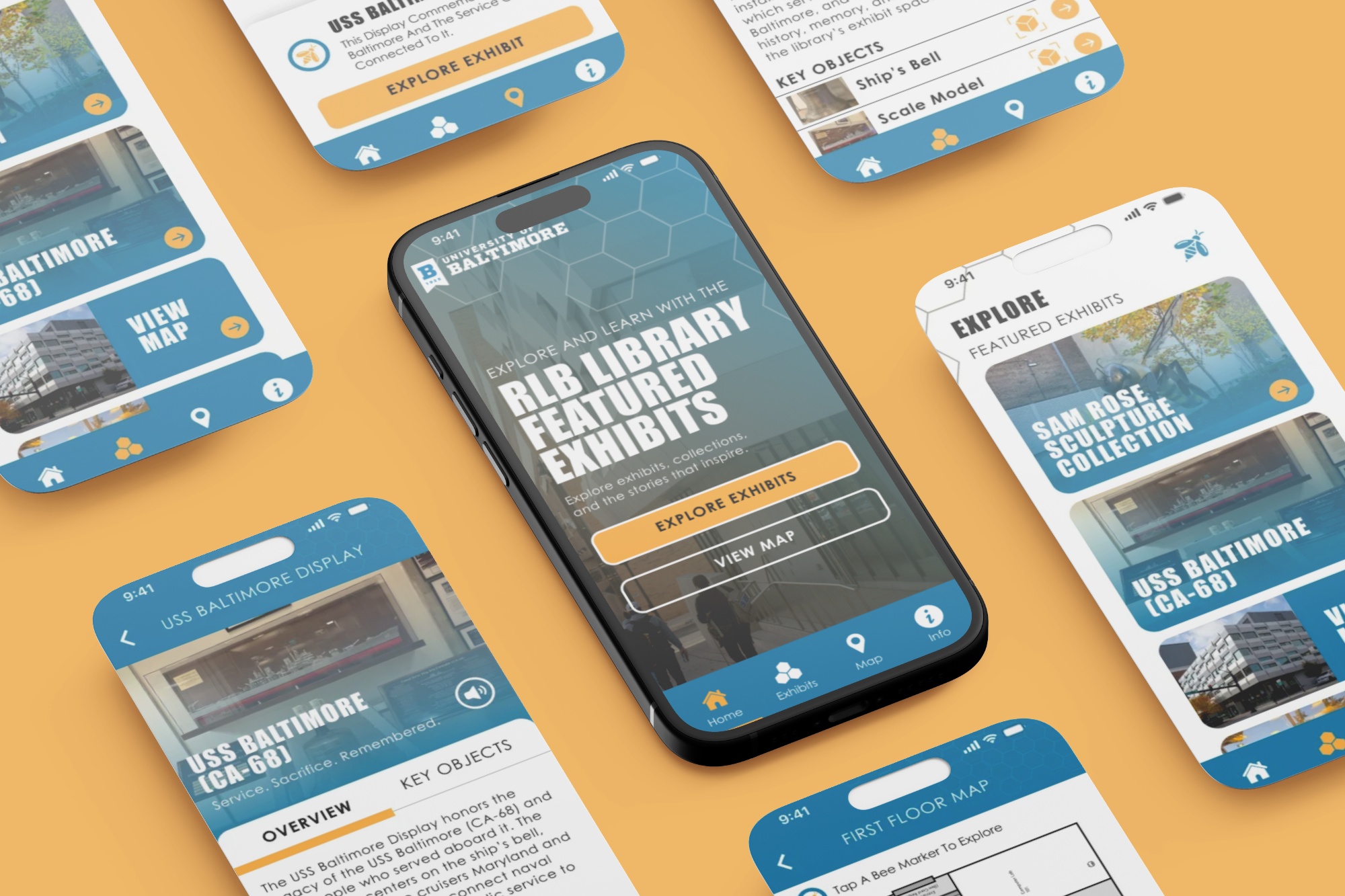
RLB Library Exhibit Guide App
The RLB Library Exhibit Guide App was designed to make library exhibits easier to explore and understand. The app helps visitors learn more about featured displays, campus artifacts, and historical collections without needing to rely only on wall text or printed materials.
The goal was to create a simple mobile experience that supports self-guided learning. Users can browse exhibits, read background information, view images, follow exhibit locations, and save items they want to revisit. The design focuses on clarity, accessibility, and making historical content feel more engaging.
Client: RLB Library / University of Baltimore
Industry: Education, Library, Museum, Cultural Exhibits
Role: UX/UI Designer
Project Type: Mobile App Design
Focus: Exhibit navigation, historical storytelling, accessibility, user engagement
Platform: Mobile app
Year: 2026
Tools: Figma, Adobe Illustrator, Canva, Research, Prototyping
The Problem
Library exhibits can be easy to overlook when visitors do not have enough context. Some displays may have limited space for written information, and visitors may not know where to start or what makes each item important.
This app gives users a guided way to explore the exhibit while keeping the experience simple and easy to follow.
Project Goals
Create a clear mobile guide for library exhibits.
Make exhibit information easier to access.
Support self-guided exploration.
Improve the way visitors interact with campus history.
Design an accessible layout with readable content and simple navigation.
Key Features
-
Exhibit Directory
Users can browse current and featured exhibits.
-
Artifact Details
Each item includes images, descriptions, dates, and background information.
-
Interactive Map or Location Guide
Visitors can see where exhibits or artifacts are located inside the library or across campus.
-
Save for Later
Users can bookmark items they want to revisit.
-
Search and Filter
Users can search by exhibit, topic, date, or collection type.
-
Accessible Reading Experience
The app uses clear text, strong contrast, and simple layouts to make content easier to read.
UX Process
The process included:
Researching library, museum, and campus exhibit guide app patterns
Understanding visitor needs for browsing exhibits and learning about artifacts
Planning the main user flow from opening the app to viewing exhibit details
Organizing the app structure with sections for exhibits, artifacts, maps, and saved items
Sketching early screen ideas for the home page, exhibit list, artifact detail page, and map view
Designing low-fidelity wireframes to test the layout and content flow
Creating high-fidelity screens with a clean, academic, and easy-to-read visual style
Building a clickable prototype to show how visitors would move through the app
Reviewing the design for accessibility, including readable text, clear buttons, and simple navigation