
UpToCode User Research Analysis
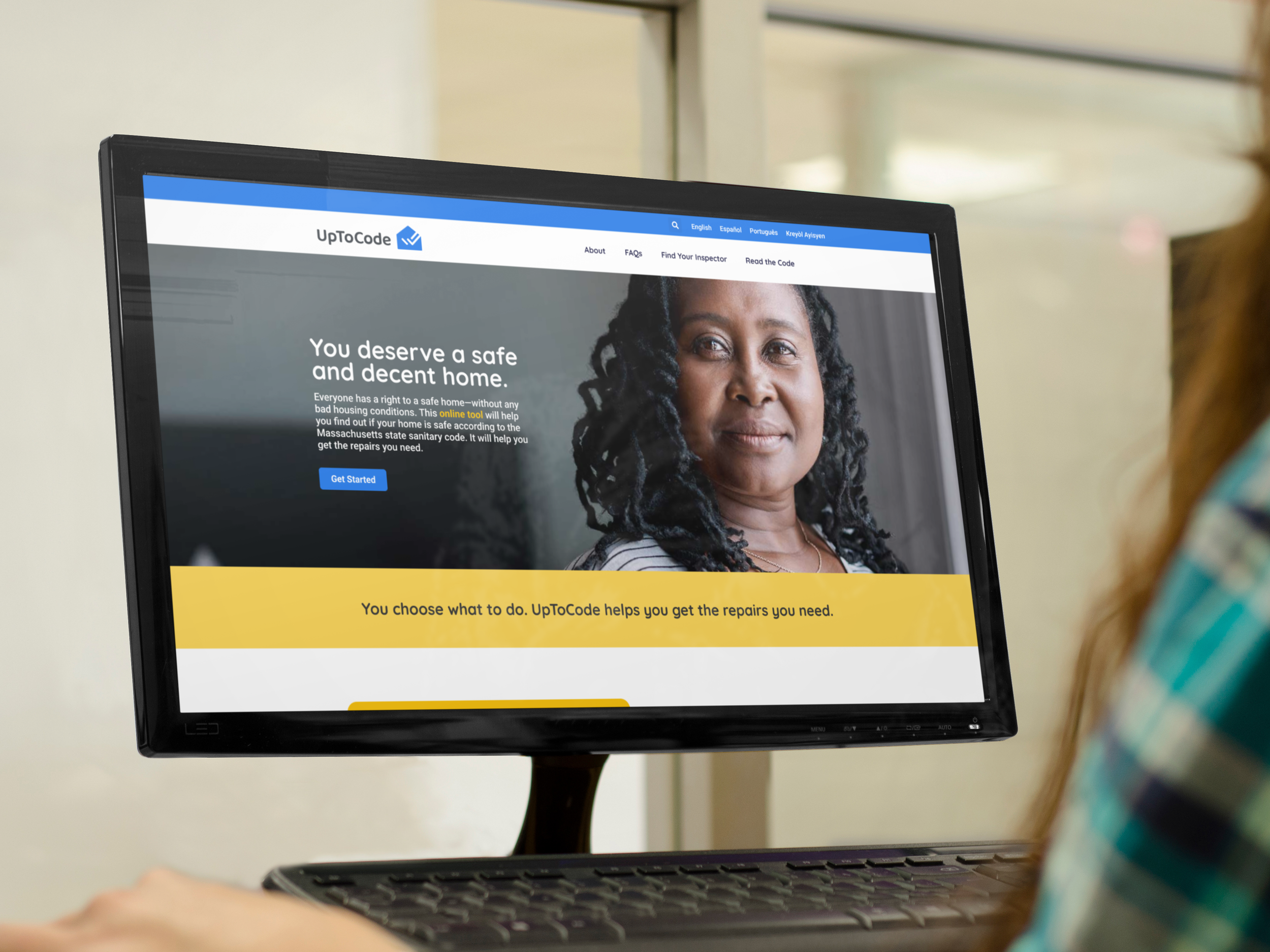
UpToCode is a legal resource website created to help renters understand housing issues and take action. This project focused on studying how users interacted with the website and identifying areas where the experience could be made clearer, easier, and more accessible.
The research included usability testing with 13 participants, many of whom were older renters with different levels of technology experience and reading comfort. Through observation, eye-tracking data, and task-based testing, the study uncovered issues with navigation, instructions, registration, progress indicators, loading feedback, and overall site clarity.
The final recommendations focused on making the website easier to discover, easier to navigate, and easier to understand for users who may not be comfortable with complex digital tools.
Client: UpToCode
Project Type: Client UX Research Project
Year: 2024
Role: UX Researcher
Industry: Legal Tech, Housing Resources, Accessibility
Focus: Usability testing, accessibility, legal resource navigation, user research, research analysis
Tools Used: Tobii Eye Tracking, One-Way Mirror, User Research Lab
The Problem
UpToCode provided useful legal resources, but users had trouble finding the tool, understanding its purpose, moving through the site, and completing key actions. Some users were unsure what the website was for, while others struggled with unclear buttons, confusing instructions, registration steps, and limited feedback during loading or progress moments.
The challenge was to identify the parts of the experience that caused confusion and recommend improvements that could support users with different technology skills, literacy levels, and accessibility needs.
Outcome
The final research analysis provided clear recommendations to improve the UpToCode experience. The proposed changes focused on stronger homepage clarity, simpler navigation, clearer instructions, improved registration, better loading feedback, and a more helpful progress bar.
This project shows my ability to conduct UX research, analyze real user behavior, identify accessibility barriers, and turn research findings into practical design recommendations.
Discovering the UptoCode Tool
Our findings revealed barriers when accessing the UpToCode tool, primarily due to its low visibility and user misconceptions about available resources:
Lack of Discovery: None of the participants were able to find the UpToCode tool through Google Search, as they did not specifically search for a digital tool but rather looking for legal advice or solutions for their problems like "exterminator".
Website Navigation Issues: The Northeast Legal Aid site, which hosts the tool, did not effectively guide users toward UpToCode. Participants who visited the Northeast site struggled to find relevant resources.
Homepage Clarity: The homepage of UpToCode failed to immediately communicate its purpose or value, leaving users uncertain about what the tool offers and how it could assist them.
Navigating the Tool
Our usability testing highlighted several navigation issues within the UpToCode tool that hinder user experience and functionality:
Inadequate Global Navigation: The current global navigation does not adequately reflect the full functionality of the site, making it difficult for users to understand what the site offers and how to access various features.
Unpredictable Button Behavior: Buttons within the tool do not behave consistently, leading to confusion and frustration among users. Predictable and standard button actions are essential for a smooth navigation experience.
Ineffective Progress Bar: The progress bar does not effectively communicate the user's current position within the process or facilitate navigation between sections of the tool. A more functional progress bar should clearly show progress and allow users to easily navigate to previous steps if needed.
Clarifying Instructions and Actions
Effective communication within the UpToCode tool is very important for user comprehension and engagement. Our usability testing indicated several areas for improvement in how instructions and actions are conveyed to the user:
Plain Language Usage: Continue to apply plain language principles consistently across the tool to ensure that all instructions are easily understandable.
Sentence Decoding: Utilize strategic bolding within sentences to highlight key information and guide users through important actions, aiding in quicker and clearer comprehension.
Sentence Structure and Visual Order: Adjust the sentence structure and the visual layout of information to enhance the logical flow, making it easier for users to follow and understand the intended steps.
Jargon Management: Remain vigilant about 'jargon creep' — the tendency for specialized terms to become commonplace in content intended for a general audience. Reduce jargon where possible and clarify necessary technical terms.
Just-in-Time Guidance: Incorporate just-in-time guidance for users by providing external links or tooltips for unfamiliar terms directly when they appear, facilitating learning and understanding in context.
Reinforcement of User Actions: Ensure that the text on the page clearly reinforces the actions users need to take, establishing a direct connection between instructions and the actions required.
Not Everyone Is a Computer Expert
Our usability testing shows the importance of designing the UpToCode tool with all levels of computer literacy in mind. To accommodate users who are not technologically savvy, we identified several user interface improvements that could enhance the overall user experience:
Informational Icons: Implement question marks as clickable icons next to complex terms or features. These icons should link to additional information, helping to demystify the content and process for users unfamiliar with digital tools.
Simplified Navigation: Minimize the need for excessive scrolling and use accordions for lengthy sections to allow users to expand and collapse information as needed. This approach helps manage content overload and focuses the user's attention on one section at a time.
Form Design Conventions: Clearly distinguish between required and optional fields in forms to prevent confusion. Use familiar label conventions, such as 'First Name/Last Name', to ensure clarity in what information is needed.
Monetary Inputs: Include a visible '$' symbol in fields requiring monetary inputs to specify the type of data expected, reducing errors and enhancing form usability.
Visual Feedback for Loading: Integrate a loading icon for actions that require processing time, informing users that the system is working and to wait, thereby reducing uncertainty and frustration.
Make it Easier to Register/Sign In
Enhancing the registration and sign-in processes is necessary for improving access to the UpToCode tool. Our findings indicate that simplifying these processes can significantly impact user engagement and retention. Here are the suggested changes to make these functionalities more user-friendly:
Simplify Registration: Simplify the registration process to reduce barriers for first-time users. This could include minimizing the number of fields required to register and providing clear, step-by-step instructions.
Flexible Registration Options: Introduce multiple registration options, such as using email, social media accounts, or even mobile numbers, to accommodate user preferences and make the process more convenient.
Simplified Password Creation: Revise the password creation process to include clear guidelines on password requirements. Consider integrating visual indicators of password strength to assist users in creating secure passwords without the frustration of repeated attempts.
Clear Menu Vocabulary: Update the vocabulary used in menus during the registration and sign-in processes to be more intuitive and less technical. Words should be simple and actions should be obvious, aiding users in understanding what steps they need to take without confusion.
Final Success or Failure
The ultimate success of users interacting with the UpToCode tool, particularly in tasks like filing and mailing, rely on clear and effective cues throughout the process. Our usability testing has revealed areas needing further refinement to ensure users feel confident and successful in their interactions:
Review Screen Enhancements: The current review screen, where users finalize their inputs before submission, requires additional testing and improvement. It is important that this screen clearly displays all information entered by the user and provides an easy way to edit details before final submission. Also, it should tell the user know they have to file in person.
Printing Cues: Enhance the visibility and clarity of printing cues. Users need explicit guidance on how to print documents if required, including steps to troubleshoot common issues like adjusting printer settings or locating the print button.
Key Findings
-
Discovering the UpToCode Tool
Many users were unaware of the tool's existence prior to the study, indicating a need for better SEO and visibility.
-
Navigating the Tool
Users experienced difficulty navigating through the website, often feeling lost between steps.
-
Clarifying Instructions & Actions
Instructions and calls to action were not clear to many users, leading to confusion and incorrect use of the tool.
-
Not Everyone Is a Computer Expert
A significant number of participants had limited computer literacy, which hindered their ability to use the website effectively.
-
Make It Easier to Register/Sign In
The registration and sign-in process was a major barrier for users, with many finding it complicated and discouraging.
-
Final Success or Failure
Users’ ultimate success or failure in using the tool greatly affected their overall satisfaction and the likelihood of future use.
The process included:
Reviewing the original UpToCode website and tool experience
Preparing usability testing goals around navigation, clarity, and accessibility
Observing participants during task-based testing sessions
Using Tobii eye tracking to study where users looked, paused, and became confused
Identifying issues with discovery, navigation, instructions, registration, and progress feedback
Reviewing how users with different technology skills moved through the website
Creating recommendations for clearer content, stronger visual hierarchy, and simpler user actions
Proposing interface improvements for the progress bar, loading state, and sign-in process
Organizing findings into immediate, medium-term, and long-term next steps